- Published on
The Ultimate Guide to Ecommerce Merchandising in 2024
- Authors

- Name
- Entaice Braintrust
If you're looking for a deep dive into e-commerce merchandising best practices, you've come to the right spot.
This isn't a listicle of 6 tactics that may or may not be applicable to your store.
This is a breakout of practical, real-world strategies that the top stores on Shopify use to generate outstanding results.
How do we know?
Because we've reviewed all their sites.
And because we've worked with many of them.
The challenge with putting together a guide like this - and the challenge you've likely come across as you've done your research - is it's difficult to know where to start. E-commerce merchandising is a (very) broad topic covering everything from homepage design to collection creation to product sorting to photography.
The other challenge? Even if you've found a topic that interests you, a particular strategy or technique might not be applicable to your store at this point in time. You wouldn't want to read a detailed overview of personalization techniques when you don't have the traffic to justify investments in the apps and tracking tools you need to pull off personalization at scale.
Here's how we're setting up this guide to address both of those issues.
First, we're going to to divide the guide into three big sections. The first section will cover all the basics. These are the table stakes best practices you should implement before moving on to other optimizations. Then we're going to cover intermediate techniques that should be applicable to most stores once they've been operating for a few years. In the final section, we'll cover the cutting-edge and advanced approaches that stores on the forefront of ecommerce merchandising are leaning into - think shopable videos and customizable, app-like experiences.
Throughout each section, we'll break out the best practices by location within your ecommerce store - whether its for your homepage, a collection page, a product detail page, checkout, or in your navigation. We'll also highlight the apps and tools you can use to actually execute each improvement.
If that sounds like a lot, that's because it is! Our hope here is to provide something comprehensive that you can bookmark and come back to whenever it serves you. And we'll keep adding new techniques over time so the guide is always up to date.
The Basic Ecommerce Merchandising Best Practices You Should Cover First
When you're launching your store for the first time - or even if you've been running a store for years - the sheer magnitude of the job to be done can be overwhelming. That's why even well-established stores haven't taken care of the basics - (seriously, go check out the navbars of even the top 20 Shopify stores, there's still a lot of room for improvement).
But don't worry, we're going to walk you through getting a best-in-class store set up step by step. If you do the items below, you'll end up with a great looking Shopify store that's ready to drive conversions.
Building out your collection hierarchy
Once you've got products to sell, the first thing to do is to place those products into collections. Collections are the primary way your shoppers will browse your products, so covering all the standard types of collections is essential for a high performing store.
We've already written about exactly how to set up a collection page in Shopify, so here we're going to focus on the types of collections you should set up right when you start your store.
There are four types of collections you'll want to have:
What's new - Returning customers love to see what new products you have on your store, so having a What's new collection to satisfy this itch is a great way to capture clicks and attention and to get your visitors browsing products.
Sale - Whether or not you're a premium brand, having a sale collection is a must. Why? Because it will likely drive 30-40% of your sales. Seriously. It's just a fact of life in the ecommerce world that everyone loves a good deal, even if they aren't price sensitive.
Ready to try a merchandising app?
Access the techniques we've used to increase collection revenue by 10% (Free).
Get access to (1) AI collection idea generator, (2) The top 20 Shopify store menu designs, (3) 20 minute video overview of advanced collection merchandising techniques, (4) Ultimate guide to collection merchandising, (5) 1 hour merchandising consultation (1 slot per week)
Best Selling - This is one standard collection type that a lot of stores ignore, and it hurts their store's performance. Shoppers love knowing what other people are buying - its the ultimate form of social proof (i.e. someone else decided that these products were worth spending money on - and not just one person).
For almost every store, a few of your products are going to end up driving the majority of revenue. Having a way to help your customers discover those products more easily is a win.
Product Categories - Once you have your what's new, sale, and best selling collections created, the final set of collections to add are collections for each of the product categories on your site. Think "Pants" for pants, "Tees" for tees ... you get the idea. It doesn't have to be anything complicated. All you're trying to do right now is to give your store's visitors a quick way to get into the categories that interest them. You can do the hard stuff - coming up with SEO-optimized collection ideas later.
And that does it - you've got a set of collections ready to go.
Now where do we put them?
Setting up your top navigation
The collections you just created are going to go straight into your navbar.
Fortunately, almost every theme on Shopify comes with a fairly decent top navigation set up. As a result, it's easy to overlook the design and fine tuning. But you shouldn't. This is a piece of your site that is going to live on every single page of your customer's browsing experience. So it's good to make sure you have the essentials covered.
Here are the things to check for in your top nav design:
Your main navigation should be at the top of your page - honestly, I've always thought left-hand navigations would take over the web because most desktop screens are wider than they are long (so there's more real estate for browsing). But the reality is a top navigation is best because it's what customers expect and because many people are shopping and browsing on mobile devices. When in doubt, go with design patterns that shoppers know how to navigate. You're trying to compete on product offering, not website navigation design.
A standout brand logo on the left - like we said, your navbar is going to be on every page of your site, so make sure your brand logo looks great and is easily legible. This is going to be one of the most clicked links in your navigation because it's the primary way users navigate back to your homepage during the browsing loop.
Center the category options you just built in the middle of the navbar - Most brands have migrated to this set up for a reason. It looks great and it works. You should start with your featured categories (What's new, Best Selling) then your Product Categories, then your Sale link. Highlight your sale category with a specific brand accent color to make it stand out. Don't worry about building a mega menu right now. You don't have the collection density for that yet.
View cart button on the right - Make sure you have a way for customer to navigate to their cart from your top nav. No matter where they are on your website, you always want them to be able to get into the first phases of your checkout flow, and that starts with your cart page. Most cart icons today include a counter for the number of products in the cart. Double check that yours does to.
We always start with the main nav build because it's going to anchor your store experience.
Now let's see how to pull that experience together as your customers navigate page by page.
The basics of homepage design for your store
Whatever you do, do NOT get stuck in the trap of continuously updating and tweaking your homepage.
Yes, your homepage is important.
But you're not at the point where slight modifications are going to make or break your revenue.
Your goal right now is to put up a homepage design that's in line with industry standards and then to get the rest of your store up to that same level. It's tempting to keep fiddling with how your homepage looks because its the first thing users see. So we'll say it one more time: do the basics and then go fix the rest of your store. If you do the basics, you'll be in a better spot than 70% of stores out there and you can have the confidence you need to leave the page alone until its worth optimizing further.
Ready to go? Here's how the top brands have chosen to lay out their home pages:
Start with the top nav - simple and straightforward, we don't have to write a lot here. It's the primary way users are going to browse your store. It should be at the top.
A killer hero image with a CTA - after the navbar, your space above the fold (i.e. before users have to scroll) should be used for a hero image that highlights a section of your product portfolio that you want to drive users to. Since so many browsers are going to be first time visitors, this image needs to do double duty - it should also highlight your brand's specific tone and aesthetic. Invest in high quality photography for this image because it's going to be BIG and prominent. It's your chance to make a statement.
Social proof - Most people will nail the top nav and hero image locations, but then they forget to use social proof, which is particularly important as brands are starting to establish themselves. We're starting to see more and more ecommerce stores steal this layout idea from the world of SaaS (where it's standard). Seeing what shoppers say about your store can give new visitors the confidence they need to hit "checkout" later. Include several quotes in a carousel.
Collection by collection links with products displayed underneath - Alright, we're two thirds of the way down the page now, and it's time to start adding links to our collection pages. For anyone that's scrolled this far (usually about 15-20% of homepage visitors) our goal is to help them discover a product category they might want to shop. Put the collection title in a large heading and then display ~4 product from that collection underneath. Start with your most important category and then repeat for additional categories in order of revenue.
Add a promo email capture section before your footer - 10-15% off promotions for first time customers with email capture is standard. You want to be investing in and building an email list now (it'll become your top marketing channel later), so having a spot to capture emails on your homepage is a must.
Put your footer at the bottom - Offset your footer in a darker color at the bottom of the page to let your customers know they've reached the end of the page. We don't have a ton to say about footer design (it's not that important, and may capture 5% of traffic overall). But you should have sections for (1) links to your product categories (2) links to your promotions and featured sections (3) general help and information (4) your cart and email capture (5) Terms, conditions, and privacy policy.
Do all of that and your homepage will start turning your visitors into browsers.
The first thing your browsers will do? Visit a collection page.
Understanding the essential elements of collection page design
If you click into the collection page of a modern ecommerce store, it can be like seeing the navigation panel of a fighter jet for the first time. How in the world did the designers pack that much functionality into their layout? Where do you even set some of those options?
Early on, you can ignore most of it.
Here's what you need to turn on and set up to have confidence in your store's design.
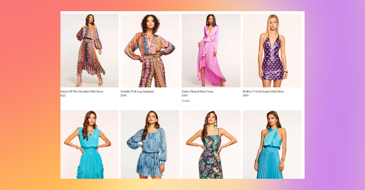
 Use a 3-4 product wide layout in grid view - Every now and then, we still come across a store that's using list view (1 product per row). Don't be that store. The goal with using a 3-4 product wide view is to give shoppers enough products within the viewport to find something interesting without completely overwhelming them visually. 2 product wide set ups lay out awkwardly because the images have to so large vertically that you can't see the complete product without scrolling. Layouts that have more than 4 products in a row start shrinking the items so much that it's hard to see the details. Now you know why 3-4 products is so common.
Enabling basic sorting options - Shopify comes with several built in sorting options (which frankly aren't the best, but they'll do for now). Add the "Sort by" functionality to the upper right hand side of your collection page design so users can adjust sorting by price and what's new if they want. This functionality is turned on by default in most themes.
Use pagination vs infinite scroll - it can be really, really tempting to follow the social media trends of loading more and more products at the bottom of a page automatically once a user scrolls far enough. Don't be one of those stores. Use pagination instead. This one's a bit of a spicier take, but we think most stores are better off using pagination because it allows shoppers to understand where they discovered a product they might be interested in.
A lot of browsers will scroll through a lot of products the first time they enter a collection, making a mental note of products they want to come back to and click into later. It's much easier for them to remember "I saw that product on the first page" than it is for them to find that same product in a sea of infinitely displayed products.
Sort your products by best selling or date added - Like we said, Shopify's default sorting options can be lacking. And if you're not using the manual sorting option (because you have bigger fish to fry right now), using the date added or best selling sorts as your starting point is best. Sorting is one of the most overlooked aspects of merchandising, so we'll come back to this one later since adjustments to how you sort your products can lead to changes in revenue of anywhere from 5-30%.
Now you have a solid collection framework to build on, and you're ready to start thinking about how to get shoppers to actually click into products.
How to take product photos that generate clicks and sales

Investing in high-quality product photography early on is probably one of the biggest CRO improvements you can make to your store.
Even large, established brands STILL have lackluster photography that doesn't convey the value of the products they're selling.
The good news? Nailing the basics isn't that difficult.
Shoot your products as flats to get started - You don't need on model shots right away (they will, however, be helpful eventually). Starting with flats has a lot of advantages. It's easy to see your products. You don't have to worry about finding a model that's on brand. You don't have to try to rehire that model every time you want to do a reshoot or add a product. It gives your pages visual consistency. It's easy to light your products effectively.
Use a gray or neutral background (vs white) - You've got the option of which background color to choose when you do the shots. Might as well make it something that's going to give your products a premium look and feel. Light greys and other neutrals do the trick. They display well on almost any store design, they cut down on the harshness of an all-white background, and they make your collection look high end all at the same time.
If you make just those two changes, you should see click through rates on your products go up dramatically.
Then you need a product detail page that gets people to hit "add to cart."
Building a product detail page that generates add to carts

When people on your site visit a product detail page, they're looking for a few things:
- More images of your products
- A detailed description of that product
- Other variants (i.e. sizes and colors) of the product
- Size and fit information
- Information about shipping and returns
So, to get started, we're just going to make sure our customer can get that information.
Simple right?
Include multiple product images - all of your product images should be consistent - i.e. taken in the same style, but offer different views of your products (front / back / side). And include zoomed in photographs when its relevant (i.e. to show the details of a fabric or a specific piece of a garment)
Write useful product descriptions in bullets - we've seen long, fluffy paragraphs written by AI. Don't use that garbage. Use bullet points to cut straight to the details a shopper needs or would want to know. If you want and have the time, include a 1-2 sentence introduction that's more aspirational.
Add ratings and reviews - We used to think of ratings and reviews as an intermediate tactic on product detail pages. But that was ten years ago. Today, customers expect to see ratings and reviews from other customers. And that's great because ratings and reviews have a number of benefits. 4 and 5 star ratings will help you sell your products. And the content of those ratings and reviews can be used all over the place - in your email copy, on your homepage, in your search ads. Nothing helps you more than positive statements from your customer base.
Display variant options as a list rather than in a dropdown - This is a minor tweak (and not all that important if we're being honest, but every little bit helps). Fully display all variant options without a user having to click into a dropdown to select a size or color. It reduces a click (which is always good in our opinion) and also gives your customer a full picture of what's available right when they click into the product. So exploring different colorways is easier, which makes it more likely someone will find a color they want to buy.
Include a size guide - Every brand fits a little bit differently, so including your sizing information helps your customers understand which size to order if they're on the fence. Processing returns can be a pain, so anything you can do upfront to reduce your return rate is a win. Size guides typically don't take long to create and can be used over and over and over again. So its an investment wort making now.
Highlight your add to cart CTA - You want your customers to add products to their cart, right? ... Right? Make it easy for them to find the add to cart button. Change the button color to a dark, highlighted color when it's ready to be hit (i.e. after a user selects a variant). Highlight the button on hover.
We. Are. Almost. There.
So far we've gotten one of our visitors to navigate to a collection page, then a product page within that collection and then add that product to cart. Now how do we actually get them to checkout?
Cart and Checkout experiences that drive conversions
You would think at this point that the world would have settled on a standard, streamlined cart to checkout experience since customers are so close to the point of purchase.
You'd be wrong.
Cart and checkout experiences are still all over the map.
We'll always be confused by stores that build unintuitive, cumbersome pages for these two functions. Don't be one of those stores. Give people a way to view their cart. And then give them a way to checkout quickly. That's all you need to do.

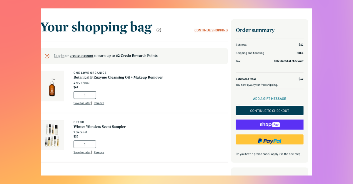
Use separate pages for the cart and checkout experiences - We've seen a number of brands start to use pop out experiences for their cart page (i.e. the cart slides out from the right hand side of the browsing page) rather than just having a separate cart page. Stick with having a separate cart page. It gives you more space to display the products that are in a users' cart (and therefore more space to use for promotional upgrades later). From a customer perspective, it also gives them a clear signal that they are about to begin the checkout flow and that they should review the items in the cart.
Implement Shopify's One Page Checkout - Shopify used to have a 3 page checkout experience, but in September 2023, they redesigned that experience to be just one page. The result according to their internal testing? An incremental 1.5% conversion lift - which might not sound like a ton - but that's a large improvement for changing the order in which customer hit buttons.
If you've checked off everything that's covered above - congrats! You should have some peace of mind: at this point, there shouldn't be anything in your site experience itself that would keep customers from converting. If you're still not seeing the magnitude of traffic you want, for right now, it'd be time to switch to focusing your efforts on building awareness and marketing.
If you already have traction, and you're seeing healthy overall order volume, along with a decent conversion rate (anything above about 1% for direct traffic is ok a this point), then read on to the intermediate merchandising optimizations you can make to drive incremental performance.
Intermediate CRO improvements
Revisiting your collection assortment - creating high converting, niche collections with keyword research
At this point, you probably have anywhere from 7-10 collections on your website, with one collection for each of your main product categories like "Sweaters".
But guess what?
That's not going to cut it.
Everyone has a sweaters category on their website. And your sweaters category might have hundreds of products in it. If that's the case, no one ever sees the products that are after the 4th page.
Now you're ready to start building out highly-optimized, keyword-rich collections that get browsers further into the purchase funnel. This allows you to greatly improve your stores SEO - you can create collections that match search queries - while simultaneously giving users a better shopping experience because they can jump straight into the collections they're most interested in. It also improves your store's results because you can compete on niches that are specific to your company. Like we said, everyone has a "sweaters" collection, but you might be one of the only stores offering "alpaca wool sweaters" or "kitschy holiday sweaters".
There are three types of collections you'll want to start adding now:
Collections based on product attributes - sure, you offer tshirts, but what kind of tshirts? Graphic tshirts? nfl team tshirts? concert tshirts? You're looking for the one and two word modifiers that better describe the types of tshirts you're selling.
Collections based on product function - Once you have the collections created based purely on product attribute, you can start adding collections that better describe the product function. For example, are you selling part dresses or wedding dresses? Hiking boots or motorcycle boots? You want to understand how your customer might be using your products. The advantage here is that you can reuse products across a huge variety of different collections to create a huge number of ways for a customer to buy and look at the same item. Often its the context that ultimately drives a purchase decision. So a customer might not buy a product when they see it in "What's new", but when they understand its specific context like "cold weather ski socks" the reason to buy becomes clear.
Collections based on trends - the final set of collections you'll want to add at this phase are collections based on trends. It takes a bit more effort to stay on top of discussion threads on Reddit and in forums, but it'll pay off because it'll give your store an "of the moment" feel - like you're responding in real time to customer needs (even if the products you offer are the same).
Creating a mega menu to handle your new collection assortment

Now that we have 50-100 (if not more collections), we're going to run into a problem with our old navigation bar.
There's no where to put these new collections.
In Shopify's default menu setup, you can add one layer of links under each topic. But that's not enough - we need a way to create a great-looking, highly organized menu.
That's where a mega menu comes in.
There's a reason 95% of the Top 20 Shopify stores use a mega menu - its the only way to streamline a robust collection browsing experience in your navigation.
When you're first implementing a mega menu, you want to:
Keep the top-level navigation from your initial collection set up - the collections we set up back in the "Basics" section of this guide are still going to form the foundation for our navigation. We're just going to be adding additional options when customers hover over each menu item.
Break down the additional collections into attributes, functions, and trends - one of the reasons we created collections based on these three themes in the section above is so we have an easy way to organize the mega menu navigation now. We see a lot of brands running into trouble with mega menus because they don't have a clearly defined collection hierarchy. As a result, they haphazardly place links throughout the mega menu and some sections have way more density than others.
Shopify doesn't have mega menu functionality built in, so here are six of the best:
- Buddha Mega Menu & Navigation –our top pick for the shopify menu app
- qikify Smart Menu ‑ Mega Menu – best mega menu app shopify has
- Meteor Mega Menu – flexible Shopify navigation menu app
- Globo Mega Menu, Navigation – great free menu app for shopify
- Power Tools Filter Menu – app for advanced product filtering
- AI Search, Filter & Recommend – menu app with Ai-driven recommendations
Thematically, the challenges we're dealing with during this phase of merchandising optimization are challenges related to browsing larger product assortments. As our stores grow in complexity, we need to give visitors easier ways to navigate the shop.
Adding on site search and recommendations
 The first way to handle the larger assortment size was to increase the structure of our navigation.
The next is to allow users to browse through our product catalog in more unstructured ways - specifically through site search and recommendations.
This is another area where, in the past, we would have added this as an advanced merchandising optimization; however, two things have changed that: (1) ecommerce is just a much more defined experience at this point. It's been around for more than 30 years, shoppers have come to expect certain functionality as a result. (2) Shopify added their own first-party search and recommendation app in 2022. Before that, implementing these setups was better left to stores with dedicated dev teams. Now you can do most of it in the Shopify UI.
You have one mission right now:
Get Shopify's Search and Recommendation App installed and set up - head over to the app store, go to https://apps.shopify.com/search-and-discovery and hit install. This isn't going to be the be all, end all search and discovery experience. But it is going to allow you to cover the basics. We're going to need this functionality to update our homepage, collection page, product detail page, and checkout designs.
Optimizing your Shopify store's homepage design with added functionality
Our initial homepage layout checked off all the basics, now it's time to come back and add in the bells and whistles that create a better browsing experience.
Split your top navigation into two separate bars - one thing you're going to notice now? That top nav is starting to get really crowded. You've got your logo, you've got your collection categories, you've got your cart button. Where in the world are you going to put your search bar? If you're asking those questions, it's time to split your top nav into two separate sections - one with the logo, search bar, and cart access buttons. The other with your collection hierarchy.
Add your search bar to your top navigation - Put the search bar in the nav section with your logo and place it on the right hand side. Some brands will try to get away with just including the search icon in the navbar and then bringing up a search box when the icon is clicked. We recommend starting with the search box itself (it's more inviting). Include default text ... it doesn't have to be anything complicated ("Search" does the job).
Anywhere from 10-15% of sessions will use on site search. So it's a valuable tool for helping visitors navigate your catalog.
Create a promo bar at the top of your page - The very top of your page is a perfect for a promo bar to advertise seasonal sales, one time promotions, or your standard discount for new shoppers. Offset these promo bars in a different color. And give users the option to close them.
Consider an email capture lightbox - love it or hate it, having an email capture lightbox (a form that pops up right when a user loads your page for the first time) is a valuable way of capturing email addresses. You can opt out of this one if you want. It is moderately annoying for customers. Generally, we try to stay away from things that might get in the way of a customer experience, but stores use this technique for one reason: it works. And capturing emails is so valuable that it can be worth it.
Add a recommended products section to the bottom of the page - Now that we have product recommendations available to us, its time to use them. Adding a section for recommended products just above your email capture form at the bottom of your homepage can be a great way to capture additional clicks from people who may have bounced.
At this point, you should have a very robust homepage that's a machine for driving users into each one of your collection pages.
How to improve collection SEO and add filters to improve product discovery
When we only had 7-10 collections, our ability to compete for SEO keywords was minimal, but now that we have a variety of niche sub collections, we can:

Start adding collection description intro paragraphs to our collections - these intro paragraphs pull straight from the collection admin in the Shopify UI. They can be a great way to help users understand exactly what collection their in (useful because generally the collection template is the same for almost every collection).
At the same time, we're starting to have a few (if not many) really large collections with hundreds of products in them. So we need to:
Add product filters to the left hand side of our collection pages - product filters allow your shoppers to quickly narrow down a huge inventory of SKUs into a subset they want to browse without leaving the collection page. Say we're in a "party dresses" collection with 200 products, but we only want to browse black dresses within the collection. No problem. This is another feature that's built into Shopify now (hurray!).
Be careful not to overdo it though. Some stores will literally fill the entire left hand pane with filter options that are impossible to navigate. The goal here is to make it easier to navigate the page, not to add more visual noise. You should make it so each collection has 3-4 filters categories that are common for the product type in the collection (i.e. sizes for dresses should go 0,2,4 while sizes for shoes should go 8,9,10).
One other upgrade that's worth making at this point?
Allow your users to add to cart directly from the collection page - It's a small quality of life improvement, but one that's worthwhile. Sometimes users just know what they want right way and don't need to go through the extra PDP view before adding to cart. The other behavior you'll see? They use their cart as a "view later" bucket to revisit products they want to investigate in more detail.
Improve our product sorting to account for lookback windows and whats new
The reality is almost no shopper make it beyond the third page of a collection, so products in positions 100+ might as well not exist. As a result, we need to improve our product sorting above and beyond what Shopify offers by default. The big improvements we should make at this point:
Pushing out of stock products to the bottom of the page - simply put: your shoppers can't but products that are out of stock, so we need to remove these products from view (until they're available again).
Using lookback windows to calculate best selling - the big problem with Shopify's built in best selling sort? It can't tell what's happened in the last 30 days from what happened two years ago. You want the ability to sort products by best selling within the last 30, 60, or 90 days (sometimes as low as even 7 days during the holiday shopping periods) so the products that show up toward the top of the collection - where products get 5-10x the number of views of those at the bottom - keep up with what's trending.
Promoting new and clearance products - You should be boosting new and or clearance products to the top of your collections for a given period of time so they can get the views they need for you to understand whether or not they are going to be future best seller.
None of this functionality is built into Shopify, so you'll have to use an app.
Fortunately, we've written a complete guide to the best merchandising apps on Shopify.
Taking your product photography to the next level
Honestly, you will be able to create a high-converting store only use flat photography. So upleveling your product photography at this point should be seen as optional.
But, if you have the time (and the budget), it is worth investing in photography that helps your shoppers understand how your products look on real people and how they respond to movement - especially if you're selling anything apparel-oriented.
Starting to use on model photography - that's where shooting your products on models comes into play. You can use models to help set the tone for your brand at the same time as highlighting exactly how a product fits when worn.
Using outdoor and on site photography - The other thing you can do once you start using models? Take your product photography out of the studio and into real world (or aspirational) environments that you want to associate with your products. Think the beach for swimwear or the mountains for outdoor gear. Natural lighting and beautiful backdrops help shoppers understand what a product might look like when they have it for their adventures.
The downside of taking the next step with product photography? It costs a lot more and is much more operationally intensive. You might be able to shoot your entire product catalog of flats in a week. But once you start hiring models and going on location, you need to establish timelines, trip plans, and travel budgets. It's also just harder to pull off. You need GOOD models. and GOOD photographers to make the extra effort worthwhile. And then there's the challenge of what happens with reshoots or a product that comes in last minute. You can recreate the same exact look you shot six months ago.
Whether or not you choose to beef up your product photography right now, you should still be in a spot where you're ready to make a few more product detail page updates.
Updating your product detail page with likes and recommendations

When a shopper visits a product detail page, its usually because something about that particular product or its photograph piqued their interest and they want to know more.
Adding product descriptions and images for variants helps satisfy that curiosity, but, a lot of the time people aren't quite ready to buy yet (it takes something like 7 pdp page views before a visitor converts). You can try all you want to get that conversion click now, but, in reality, people only buy once they're ready.
So you might as well lean into that behavior by giving them a way to store that product and revisit it later and by giving them a way to see other similar products.
Adding like buttons to your product detail pages - Adding a like button is a great way to help users store products they want to return to in the future without having to add that product to their cart (some people will still add to cart anyway). Like buttons have an added benefit: they help signal to other shoppers what's trending and what's popular. And we're going to use that information to our advantage in the Advanced Techniques section of this guide.
Including product recommendations below the fold - Now that we have our recommendations feature set up from earlier, deploying it on the product detail page right below the fold is a great way to capture additional shopper interest in the same product category.
Extra conversion boosters for your cart and checkout
One more spot to add recommendations - we told you recommendations were going to be useful. And that's because they fit in nicely to so many pages, including your add to cart page. Adding recommendations to your cart page is specifically useful for two big reasons. The first: your customer is already very close to checkout, so anything you can do to increase your average order value is huge win. The second? we already know what type of products our customer has in their cart - so we can provide very accurate recommendations that are likely to lead to additional conversions.
Incorporating interest-free checkout providers like Shop Pay - For big purchases (and even some small ones), giving your customers the flexibility to pay over time at a zero percent interest rate is incredibly attractive. Especially because shopping tends to come in waves. You might not have $1000 in your bank account to cover all your holiday shopping needs. But you could pay it easily over 6 months. You don't want to lose purchases over a financing decision.
If you completed the basics section of this guide, you've already got a killer store.
If you completed the advanced section, you're already among the top 10-20% of store on Shopify in terms of merchandising optimization.
In the next section, we're going to cover the cutting-edge techniques only the leading experimental brands are using.
Advanced Ecommerce Merchandising Techniques that the Pros Use
 Once you nail the basic and intermediate techniques, you can start to wonder: what's next? What other options are their for improving my merchandising.
And ideas can be increasingly hard to come by because only a few stores are really at this level.
It's not just that they've implemented the basics.
It's that they've gotten so good at them that they have the time to (1) invest in more experimental techniques with uncertain returns (2) maintain more difficult and time consuming workflows required to pull of those techniques.
Incorporating user generated content into your homepage, collection page, and pdp layouts
Remember when we talked about using on-model photography in the last section of this guide? Well brands are starting to take the concept a step further by allowing users to post pictures of themselves to specific (usually Instagram) hashtags and by displaying those photos on their website. This setup usually comes in three different flavors:
Adding an instagram feed to the homepage or collection page - this is usually just a catch all feed of users wearing any one of a brand's products displayed in reverse chronological order. It's a nice touch, but it's not really going to move the needle.
Adding a product-specific carousel to a product detail page - this is where the real benefit of UGC comes in in our minds. Users can share images of themselves wearing the specific product that a shopper is currently viewing. So not only can those browsers see what the product looks like on a normal person, they can see what it might look like in their own instagram feeds when their friends see it.
Adding UGC as the featured image of a product on a collection page - almost no one is doing this today, but it's an experiment that might be worthwhile. Why? Because the PDP pages with matching UGC images see conversion rate improvements relative to model and flat photography. And on-site images within a collection page tend to get more clicks. So would pictures of real life people get the most engagement on a collection page?
Adding images and promotional sections to your mega menu

There's menus.
There's mega menus.
And then there's mega menus with product and promotional imagery in them.
It's the furthest we've seen the mega menu concept pushed to date. Brands will use high quality photography to increase the CTR on desired collection links. And they'll add a section to the right hand side of the mega menu to allow for additional promotional callouts.
Establishing an editorial voice through collection curation
The best Shopify stores don't just respond to trends, they set them.
That's where buliding an editorial voice comes into play.
It's no longer about optimizing your collections for SEO. It's about using your perspective and insight to create the collections that people will be searching for in the future.
Usually, the leading brands have started to establish their own identity through curated product selections and excellent photography. Now its time to use that authority to start building editorial collections that curate products in new and intriguing ways.
The early versions of this often resemble "Staff Picks" collections or unique collaborations. But it can be pushed further.
Try a adding a "Featured" section to your navigation with a variety of different editorial collections to see what sticks.
Collection pages that resemble Spotify and Youtube, not Shopify

Want to know whose really leading the way when it comes to merchandising collection pages?
It's not Ecommerce stores.
It's consumer SaaS apps like Spotify and Youtube.
What do we mean exactly?
Spotify and Youtube have a really similar challenge to collection pages in Shopify when you think about it. They're trying to display the most relevant content to browsers at the right time to generate clicks and engagement.
And while Ecommerce has been stuck in the grid view since 1995, Spotify and Youtube have been consistenly innovating based on incredible volumes of user data.
What do they do differently?
Establishing for you collections - custom-built, highly tailored collection pages that are specifically based on your past browsing and listening experience. And they aren't just titled "for you", there are also a variety of recommended collection types that they generate based on what you've been clicking on.
Adding randomization into the product list - Youtube experiments with this concept every few months. Basically, rather than showing another related video in position 20+, they'll throw in a random promotional card that asks you if you want to look for something else. They know exactly when you're attention is waning and when to redirect it. The best ecommerce stores are following suit with promotion cards in place of products in lower positions on the page.
We're moving toward a world where users expect content to be curated for them rather than browse or scroll infinitely.
Creating dynamic, visually engaging product displays on the fly
Today, the brands that do the best job merchandising their product assortments do so by meticulously blending data and product imagery to get a product layout that both looks great and is optimized for conversion.
But the next generation of applications does all of that for you, every few hours.
Basically, its not enough to merchandise a page to put your high converting, high margin products at the top of the page.
You need to be able to create custom product groups that showcase product sets or similar imagery next to one another to avoid the Dollar Store Affect.
Two years ago, this wasn't possible without a team of merchandisers staying on top of your product inventory and constantly moving items around as they went out of stock or became available.
Today, the best merchandising apps can do all of that on the fly multiple times per day.
Adding a human touch to the web experience
Constantly updating and refreshing your product sorting and merchandising can give your ecommerce store a more human feel, but so can adding on site chat the experience.
When you're in a store, its generally easy to find the help you need with products from someone in the store - whether its an associate or a cashier or someone in the fitting rooms. But the online analogy for that experience doesn't exist on most sites.
More and more stores are turning to on site chat to bridge the gap.
In the past, stores avoided it because it was expensive to implement. You had to have someone available 24/7 to answer questions about your entire product catalog from any number of simultaneous queries.
But a new generation of chatbots powered by large language models that can adapt to your store's specific catalog and tone are making the experience accessible for stores of all sizes.
Completing the look

Recommendation engines start out providing generic "people who bought this item also bought" style recommendations; but the more customizeable engines include the option to develop "complete the look" product groups to sell items as a package.
Integrating marketing and merchandising
This level up is more operational than it is technology-based.
As you scale, coordinating the efforts of your marketing team and your merchandising team gets progressively more difficult - they'll often report into different managers who have different programs going on and who sometimes have different overall business priorities.
As a result, your marketing and your merchandising get out of sync.
Is this you?
You spent 20 hours designing the perfect holiday email sequence.
You've artfully curated a list of high converting products to promote.
Your brand team poured their hearts into creating stunning imagery.
Your subject lines and copy are top notch.
Then a customer clicks on your email.
And they can't find those products in your collection.
Getting to a place operationally where you can make sure your merchandising aligns with your marketing calendar is a best practice only the best stores do - because they're so invested in their customer experience that they've built their internal operations to support their users.